Hey everyone,
So having just recently done that Bastion for the Smells Like Wargaming and The Independent Characters Podcast Bastion Painting Contest, as well as the Aegis Defence Line pieces during the Xmas holidays, I figured it was time to touch on an overly neglected aspect of the hobby.
As of right now, Games Workshop produces about 30 different plastic and resin terrain pieces for Fantasy, 40k, and Lord of the Rings. Companies such as Armorcast and Pegasus produce plastic and resin terrain pieces for a whole host of miniature games. Getting a great looking board full of excellent looking terrain is much easier than the days of building cardboard and foamcore buildings….not that those are inferior! My biggest gripe with these pieces, though, are the huge amount of detail and the fact no one really spends the time they need to to make them look great!
Presented here are Granesh’s tips, tricks, and methods for creating excellent looking terrain relatively quickly and easily.
Painting Plastic and Resin Terrain
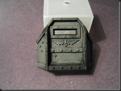
1) Start with a dark base. I’m using Charadon Granite, but Orkhide Shade, Dark Flesh, Necron Abyss, any of these colors work, depending on your desired final color.
2) Pick your main base color. I’m going for an Imperial Navy Grey, so I grabbed Adeptus Battlegrey. Create a 1:1 mix of the two colors, and overbrush them over the piece.
WORD TO THE WISE: Use a crappy brush. I have an old, beat up brush I use for overbrushing.
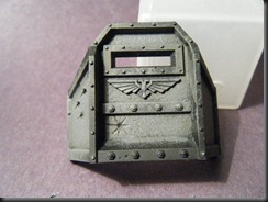
3) Drybrush your second color onto the piece. If you want a lighter shade past this point, mix in a tan or grey, or just grab a lighter paint, mix the colors, and proceed.
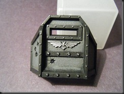
There we are. A nice, quick job that holds the detail of the piece, as well as looks good. Now, I’m going to go back over the edging with black, but any suitable color of your choice works. My Granex 25th Defence Lines have a Dark Flesh with Tallarn Flesh drybrush on them. Do the same thing, apply a base color, then a light drybrush of a lighter color on the edges.
I also picked out every rivet, as well as the Aquilla, with Chainmail. Trust me, this step is worth it. The rivets are a key piece to the texture of the piece, you want them to stand out.
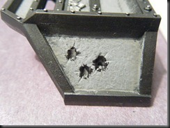
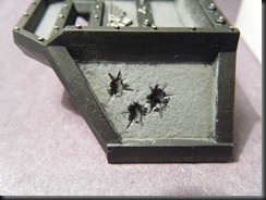
Next up, we want to hit the sculpted battle damage. Most of GW’s 40k terrain has bullet holes, burns, dings, etc. This is really easy to take care of.
1) Dab Chaos Black into the damaged areas. Its alright if the black gets onto the grey areas, it’ll give a charred appearance.
2) Using either a fine tipped brush (my preference) or a thinned wash, carefully darken the cracks and cuts around the hole.
3) Using the sponge technique, add some rough chips and dings around the hole. Here’s a link to a previous tutorial I did on Battle Damage.
You’ve got a good looking piece of terrain so far! But doesn’t it seem a little bland? You’ve got some options!
- Waterslide Decals make adding symbols and numbers easy!
- Chevrons/Hazard Stripes make the area look more dangerous.
- Blood makes the terrain look like its been recently fought on, but go light on the blood; theres a difference between tasteful and juvenile.
- Graffiti gives the piece an urban, used appearance.
I’m going to touch on Graffiti, as it seemed to be the biggest point of my terrain when I did my pieces over the holidays. Writing on terrain can be a little sloppier and quick, as no one is measuring or stenciling “Screw the Emperor” on the side of a building, the Arbites wouldn’t allow it!
1) Decide on what you want the Graffiti to say. I wanted to pimp the blog and myself a little, so I stuck with “Smells Like Wargaming” and “Granesh”. As for colors, White and Black usually work well. Red could be done for a bloody scene (remember, TASTEFUL!)
2) Pick your area, and just like writing on a piece of paper, begin painting your saying onto the piece. Its ok if it curves or the letters change size, it adds to the rushed, impromptu feel of the graffiti.
For areas with a little less space or something a bit more formal, designate how many letters in are in the word or statement, and figure out the central letter. For “Granesh”, its “N”. Put that in the center of the area, then proceed to do the letters on both sides.
Finally, before I finish, there’s one final thing I want to touch on. When doing things like gems, lenses, etc., stick with a complimenting color. With Grey, any color works well, but for things like OD Green, use a Red. For an Ultramarines Bastion, use an orange or orange-red. These colors will bring the piece together, and add some interesting focal points to the entire thing.
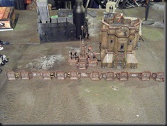
Here’s some other examples to get the creative juices flowing!
So everyone, stop neglecting your terrain, I know I have. With a little time and effort, your terrain pieces can look just as good are your models, and everyone loves playing on terrain that compliments their models!
Granesh





This is like a page from Rogue Trader, but fresh in 2011. It still looks good.
ReplyDeleteI'm glad you like it Porky. The community needs more down and simple painting and modeling articles, kind of like the old GW website.
ReplyDeleteI agree the more basic and quality painting and modelling tutorials that we have the more people can expand their skills.
ReplyDeleteNice tutorial. Loving your blog more and more!